Colours are so important to our every experience. Even when you don’t notice them, there they are, shaping a place or supporting a visual with warmth or coolness, brightness or darkness, similarity or contrast. The power of colour comes from emotion — how we think and feel when we see them. From historically created meanings to deep-set biological reactions, we give story to colour as colour gives substance to our visual world.
In our annual Colour Trends report, we look for colours that have seen increased activity in the last year, popping up in more image downloads than ever before. By looking at the HEX code data in each pixel, we can see the hues that are primed to dominate in the year to come. These are the colours that will tell the story of 2021, appealing to universal audiences in visuals across the world.
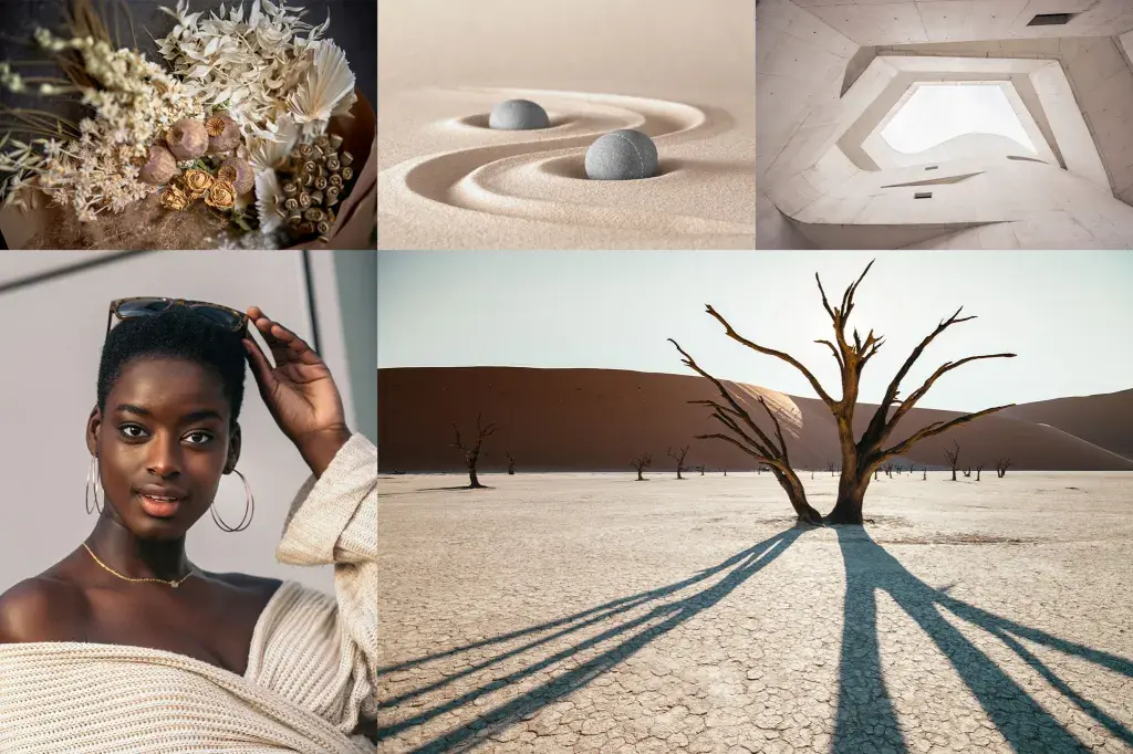
Can you see the sails unfurling on your personal getaway vessel? After a year of head-jerking change, we’d all like to ship ourselves somewhere far away from it all. With its soft, organic feel, Set Sail Champagne is a natural, blank canvas of escapism — make it what you want (or need).
Set Sail Champagne is a natural hue that can be used in any scheme, especially earth-toned colour palettes featuring browns, taupes, and greens. If you look closely, you’ll see that Set Sail Champagne is a soft, white tint of orange. The glow from its parent colour makes it a complement to blue-hued schemes – just like a sailboat on the open water. Try it paired with a classic baby blue or an oceanic teal, like this year’s Tidewater Green. As a pastel orange, Set Sail Champagne is also at home in any pastel palette. Give light colours a modern treatment with a glowing, holographic gradient of its analogous sisters: a rosy pink and a mellowed out lime green.
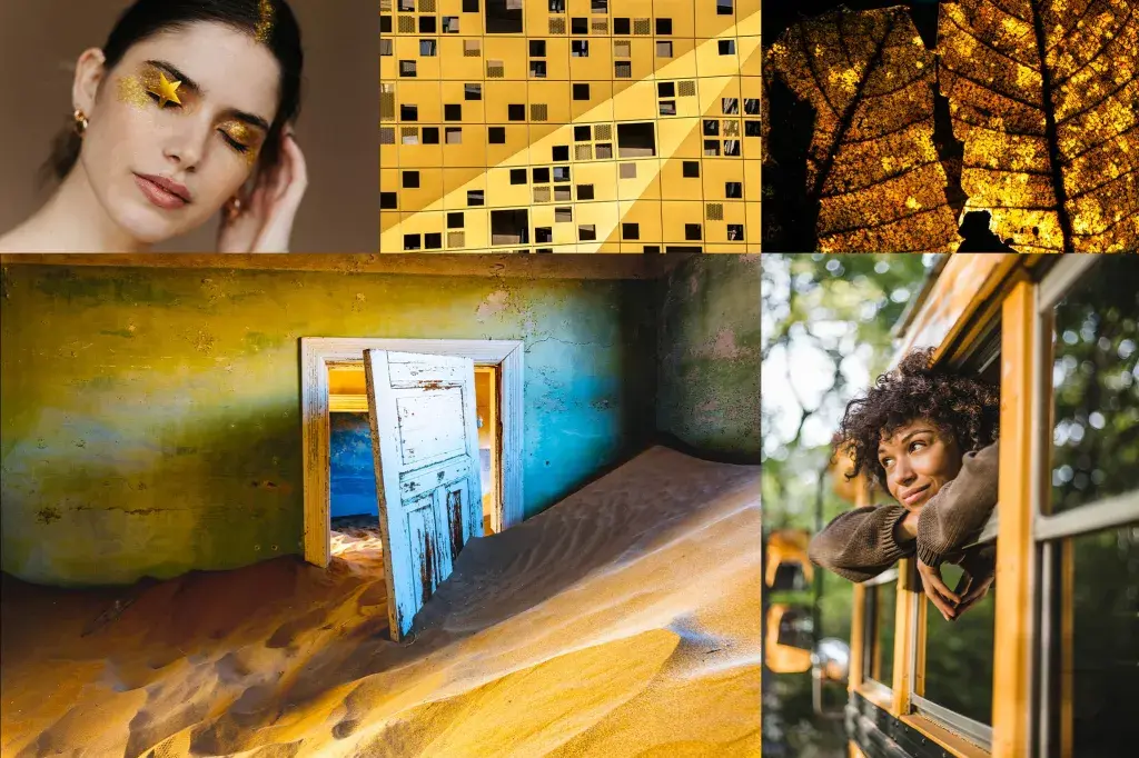
Fortuna is the Roman goddess of good fortune. Maybe you know her as Lady Luck. This warm, deep gold is her colour, representing chance happenings and happy coincidence. Like dappled sunlight at golden hour or autumn leaves lining city streets, you can find this exquisite yellow in life’s brief, shimmering moments of felicity and fate.
Fortuna Gold is a dark, rich shade of yellow. Its spectrum features variations on gold, from light shimmering pastels to dark, almost metallic golden browns. Fortuna’s direct complement is Cerulean blue, creating a high-profile palette that brings to mind fields of wheat and deep blue skies. For a gentler palette, try Fortuna mixed with Set Sail Champagne and other earthy tints, like terracotta or ochre. At its heart, this golden yellow is high drama, and it likes to be paired with other intense colours. Create a striking palette by embracing its amber qualities and pair Fortuna Gold with other jewel tones, like amethyst purple and turquoise green.
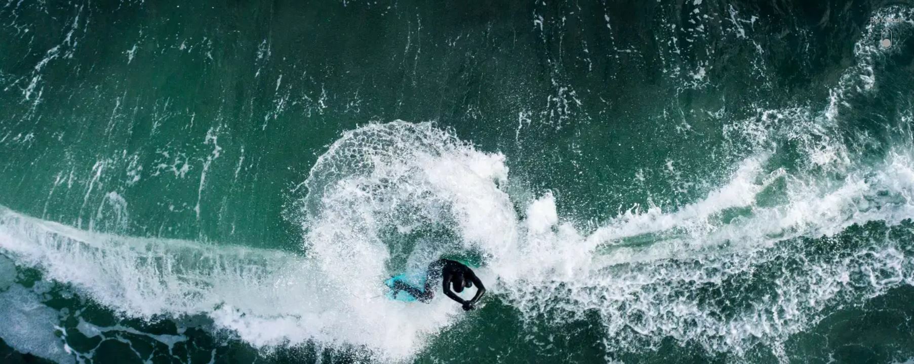
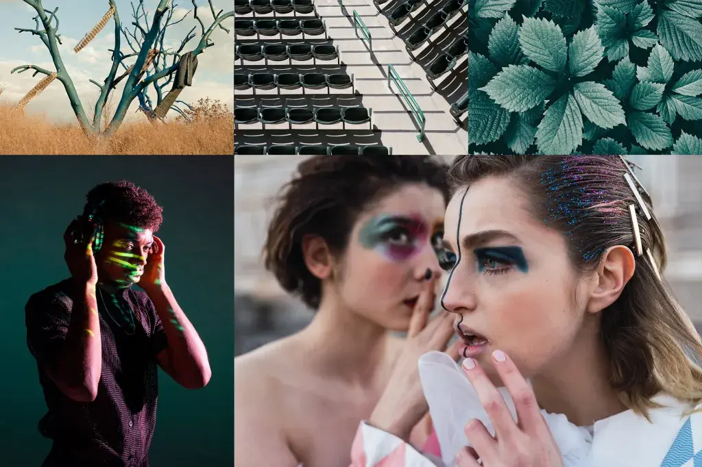
Like the sun rising, the seasons changing, and the earth spinning on its axis, the ebb and flow of ocean tides is constant. Tidewater Green is a reminder that change is a given. This deep, molten teal presents with both yellow and blue tints, adding to its dynamic power. At once a thick jungle canopy and a dark body of water, the beauty of Tidewater Green lies in its fluid nature.
Tidewater Green’s base colour is teal, making this rich hue a grey tone of blue green. With its roots planted in both the blue and green spectrums, Tidewater Green has a complex series of complements. On the colour wheel, its direct companion is another hybrid color, red orange. These colours match up well in super saturated schemes that mimic the blue green of the ocean and warm pops of color seen in fish and coral reef. Tidewater Green also works as a rich grey with unmistakable character. Use it to ground lighter, brighter palettes featuring its triadic counterparts, like an airy lavender or a modern sage green.
Article from: https://www.shutterstock.com/blog/trends/color-trends