Every year, the Dulux Colour Forecast gives us a glimpse into the shades and moods shaping the way we live. For 2026, it’s all about creating homes that feel like havens. Spaces where we can pause, reconnect, and feel grounded in an ever-changing world. The forecast leans away from stark contrasts and instead embraces warmth, softness, and colours that nurture well-being. Think gentle pastels, earthy neutrals, and rich, soulful tones that work just as beautifully in family homes as they do in modern apartments or commercial spaces.
As Dulux Colour Specialist Davina Harper explains, “We’re seeing a strong shift towards comforting and nurturing colours that foster positivity, well-being and security.” Whether you’re looking for subtle updates or a bold refresh, the 2026 palettes offer plenty of inspiration.
Ethereal: Dreamy, Uplifting Calm
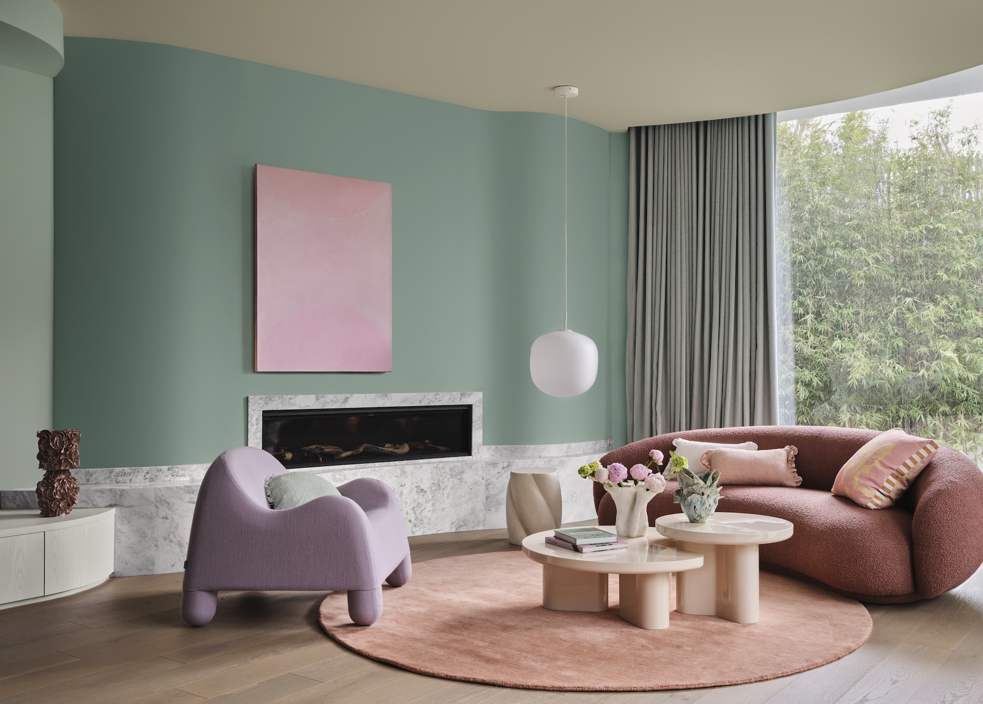
If you’re dreaming of a home that feels like a gentle escape, the Dulux Ethereal palette could be just the inspiration you’re looking for. Designed as a soft, uplifting refuge, Ethereal brings together soothing greens, mauves, and blush pinks that feel joyful, restorative, and quietly luxurious. Think vintage rose, warm buttercream, and calming pastels, all inspired by nature and paired with a hopeful outlook on the future.
Romantic tones like Dulux Different Pink or Snowdon Forest add whimsy and warmth, while subtle pastels like Lake Camp or Waitiki Landing bring a dreamy softness. Paired with light timbers, delicate fabrics, and reflective finishes, Ethereal creates a sense of serenity, tenderness, and playful charm, a palette designed for true sanctuary living.
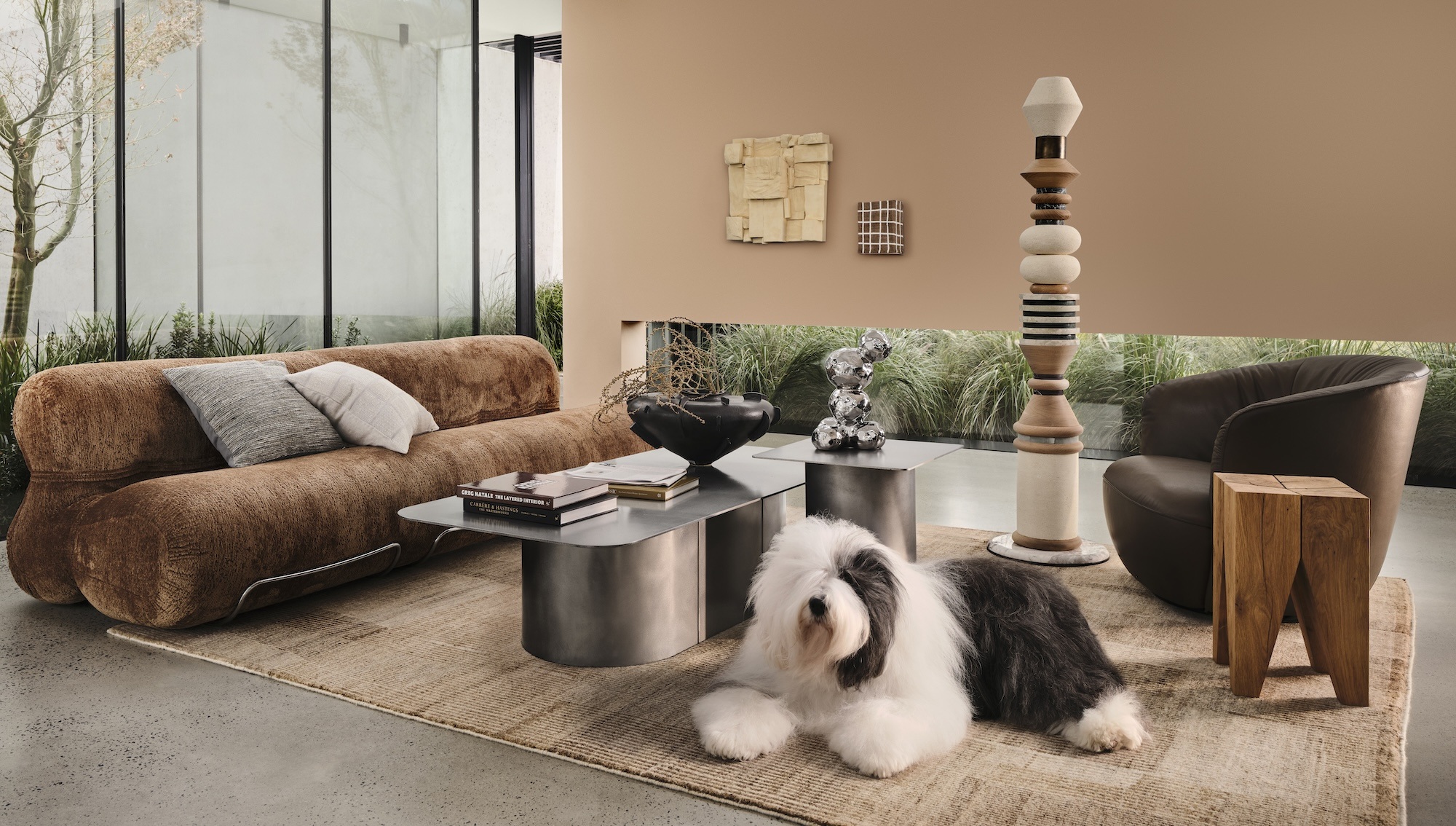
Elemental: Grounded, Intentional Living
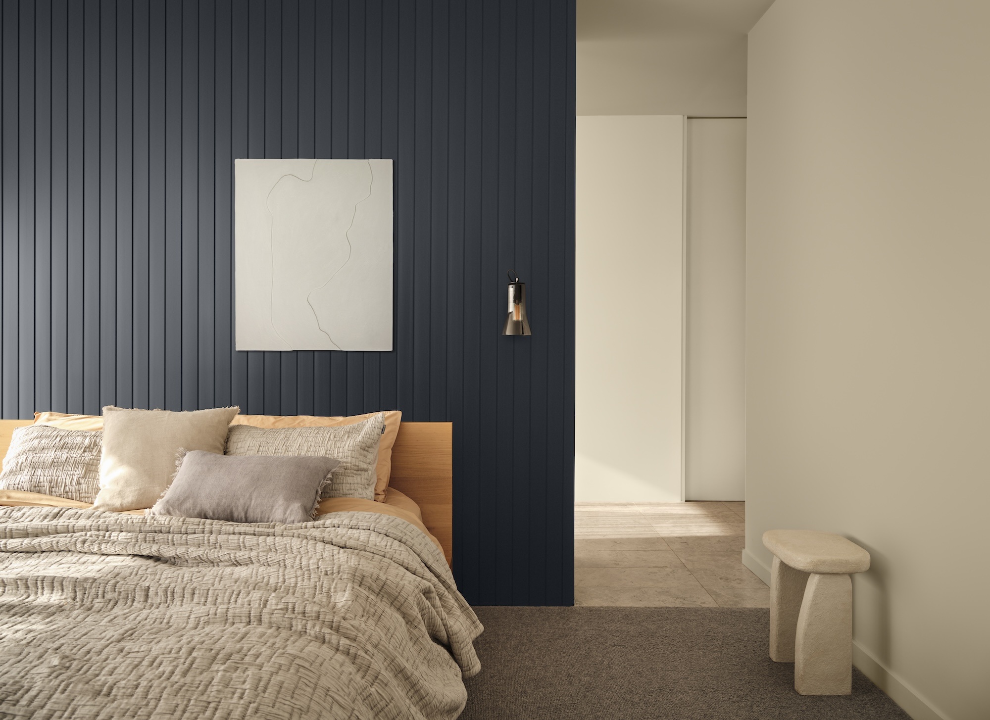
If you’re craving calm and simplicity in your home, the Dulux Elemental palette offers the perfect antidote to the chaos of modern life. Rooted in slow living and inspired by minimalist, architectural design, this palette creates interiors that feel grounded, intentional, and timeless. It’s about stripping things back to what really matters, function, mindfulness, and spaces that restore rather than overwhelm.
Elemental is rich in warm whites and neutrals like Dulux Whale Bay and Duvauchelle, layered with caramel accents, burnished reds, and deep chocolate tones such as Dulux Herald Island. Structured greys like Godley Head and Boulder Beach add calm and clarity, while charcoals like Dulux The Remarkables and earthy browns like Dulux Kingsland bring depth and balance. Pair these tones with raw, enduring materials like stone, timber, and concrete for a look that is strong, enduring, and effortlessly sophisticated.
Evoke: Bold, Character-Filled Style
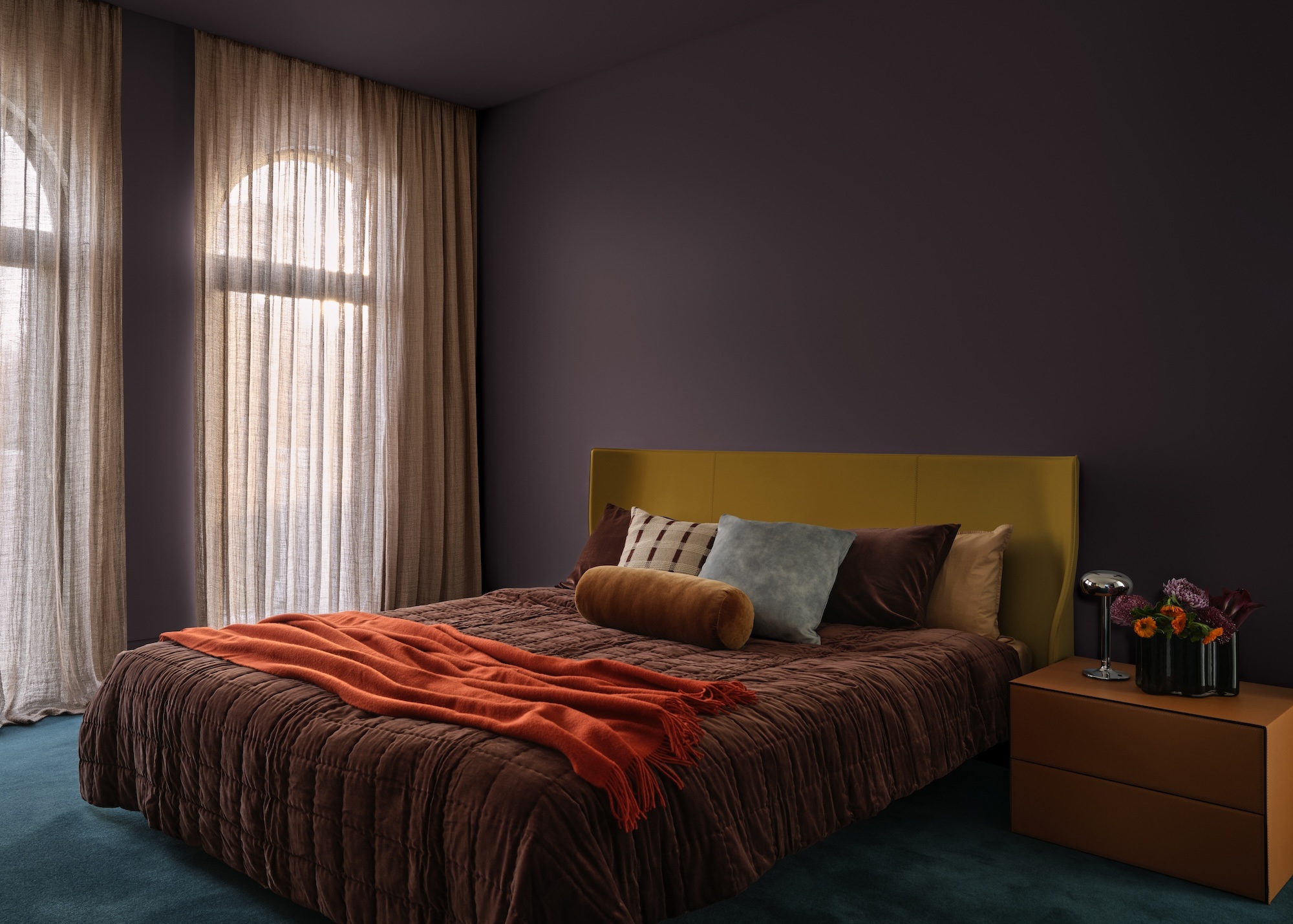
For those who love personality, richness, and a touch of nostalgia, the Dulux Evoke palette is pure joy. Celebrating the return of maximalism, it blends vintage charm with modern flair, treasures collected over time, bold accents, and a celebration of artisan craft. Rather than bright pops, Evoke leans into rich, comforting tones: clay pinks like Dulux Benhar, burnt oranges, and warm golds form the base, while deeper shades like Dulux Warkworth or Deep Aqua add drama and cultured character. The result is interiors that feel layered, expressive, and full of life.
Evoke is also about sustainability and conscious living, with a big focus on reusing and reinventing. From retro rugs and statement lighting to glossy mid-century furniture, it’s about mixing old and new to create spaces that feel authentic and unique. Materials like marble, velvet, faux fur, and darker timbers bring texture and depth, while touches of chrome or copper keep it fresh. The look is anything but pared back. This is about warmth, individuality, and interiors that tell a story.
How to use these palettes in your home...
The beauty of the 2026 Dulux Colour Forecast is its versatility. Whether you’re drawn to the dreamy calm of Ethereal, the quiet order of Elemental, or the expressive warmth of Evoke, there are easy ways to bring these palettes into your home.
Bringing it all together
The 2026 Dulux Colour Forecast reminds us that our homes are more than just walls and furniture. They’re the backdrop to our daily lives, our connections, and our sense of comfort. Whether you lean towards soft serenity, minimalist calm, or eclectic vibrancy, the right colours can transform the way your home feels. And the best part? You don’t need a full renovation to make a difference. Sometimes, just a brush of paint or a few accents can create the shift you’ve been craving.
Explore the full Dulux Colour Forecast 2026 colour palettes online at Dulux.
Image Credits: Photographer Lisa Cohen, Stylist Bree Banfield. Interior Scenes: Design Bree Banfield. Images Clinkr Studio.