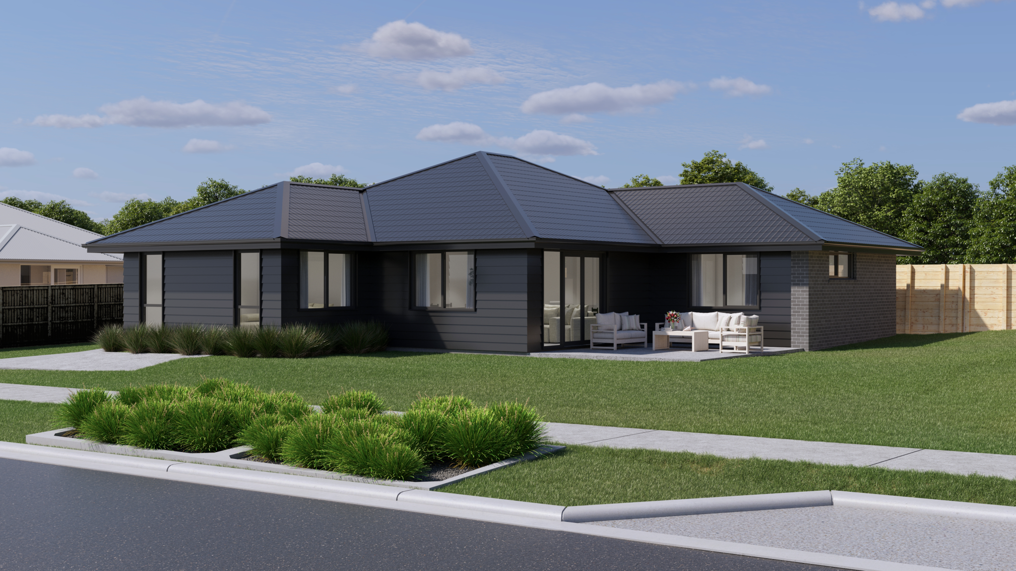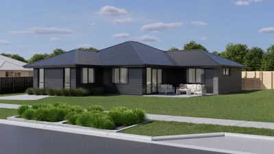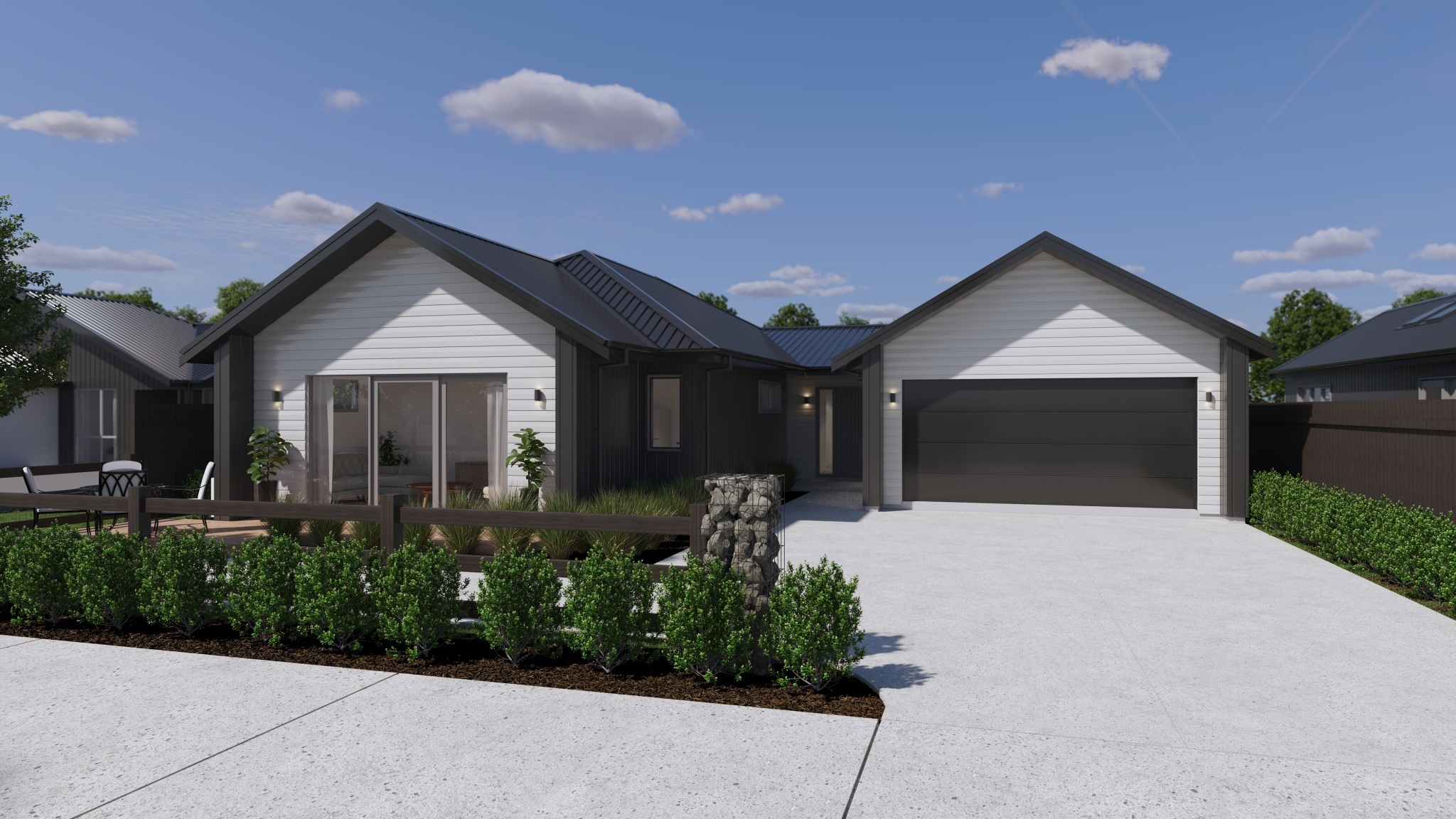
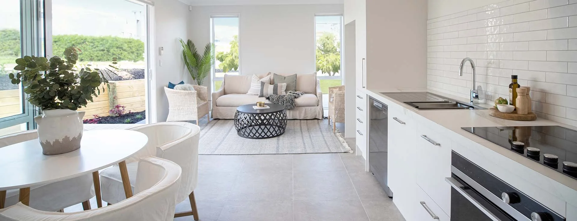
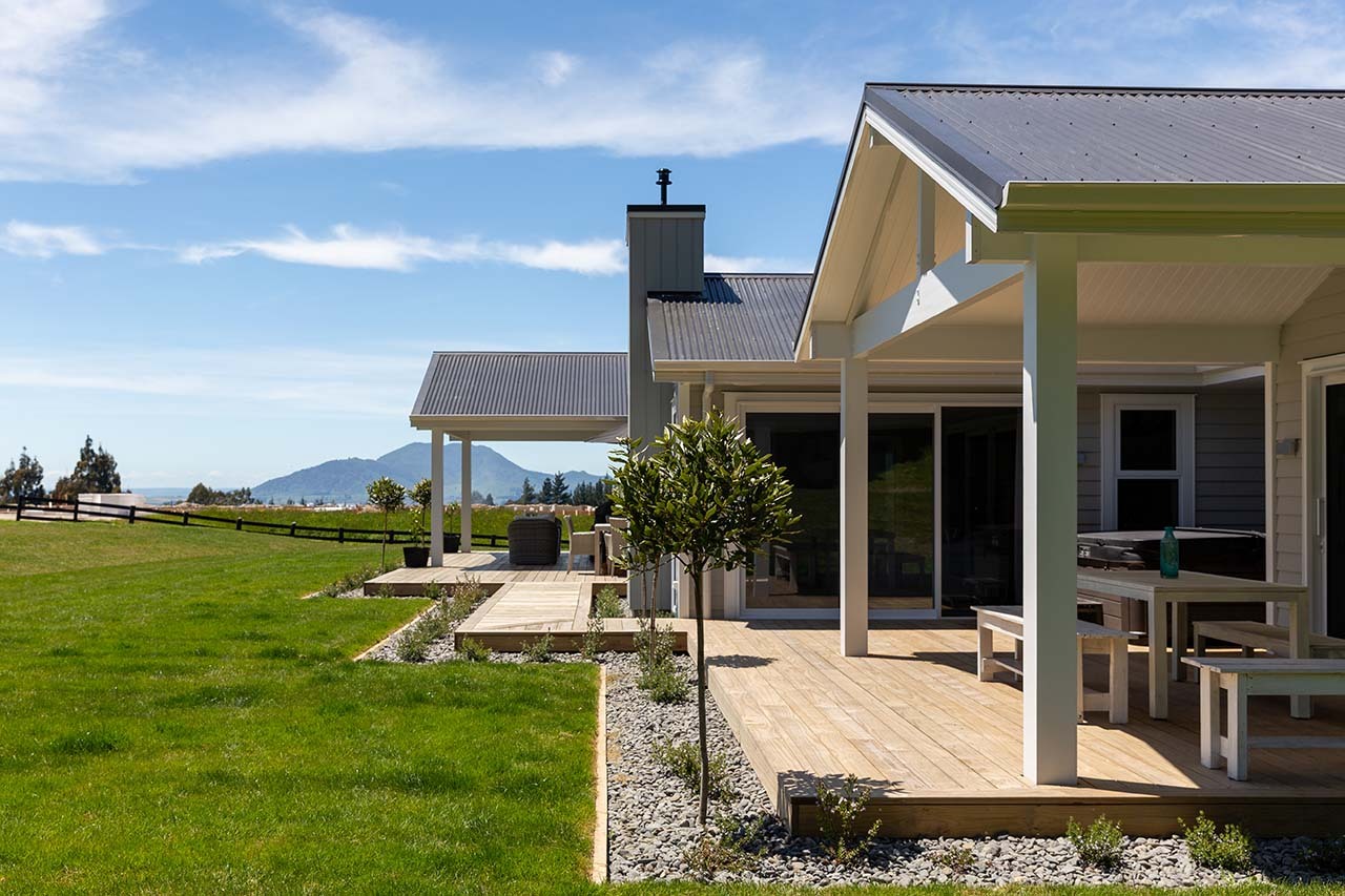
Woodlands Rise - where the lifestyle you’ve dreamed of comes to life

GET IN TOUCH

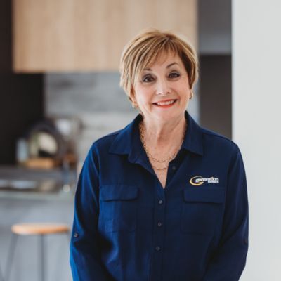
Peter has been in the Building Industry for 30 years, progressing from carpentry apprentice through to site management before moving into the Auckland “Group housing” industry. The experience and knowledge gained to date provides a sound platform for the growth of Generation Homes within the Northern region of Auckland.
Nadine has been working with Generation Homes for a number of years and is familiar with the property market in the northern suburbs of Auckland. If you are looking to build and would like to know more about our process and packages available, speak to Nadine today.

Norman is an expert in the housing market in the northern suburbs of Auckland. He will be able to talk you through the different options we have in the market at the moment. If you are looking to invest in a rental property, Norman has a high level of knowledge around the current rental market and returns.

Mackenzie Suckling has building in her DNA, having grown up with her father, Peter Suckling, the Managing Director of Generation Homes Auckland North. With a deep understanding of the industry from an early age, Mackenzie has seamlessly progressed into her sales career, thoroughly learning the background of the business. Her proficiency with computer systems ensures seamless administration and effective marketing strategies. You are in great hands with Mackenzie, as she understands building from the ground up. Let Mackenzie show you how Generation Homes makes building easy.
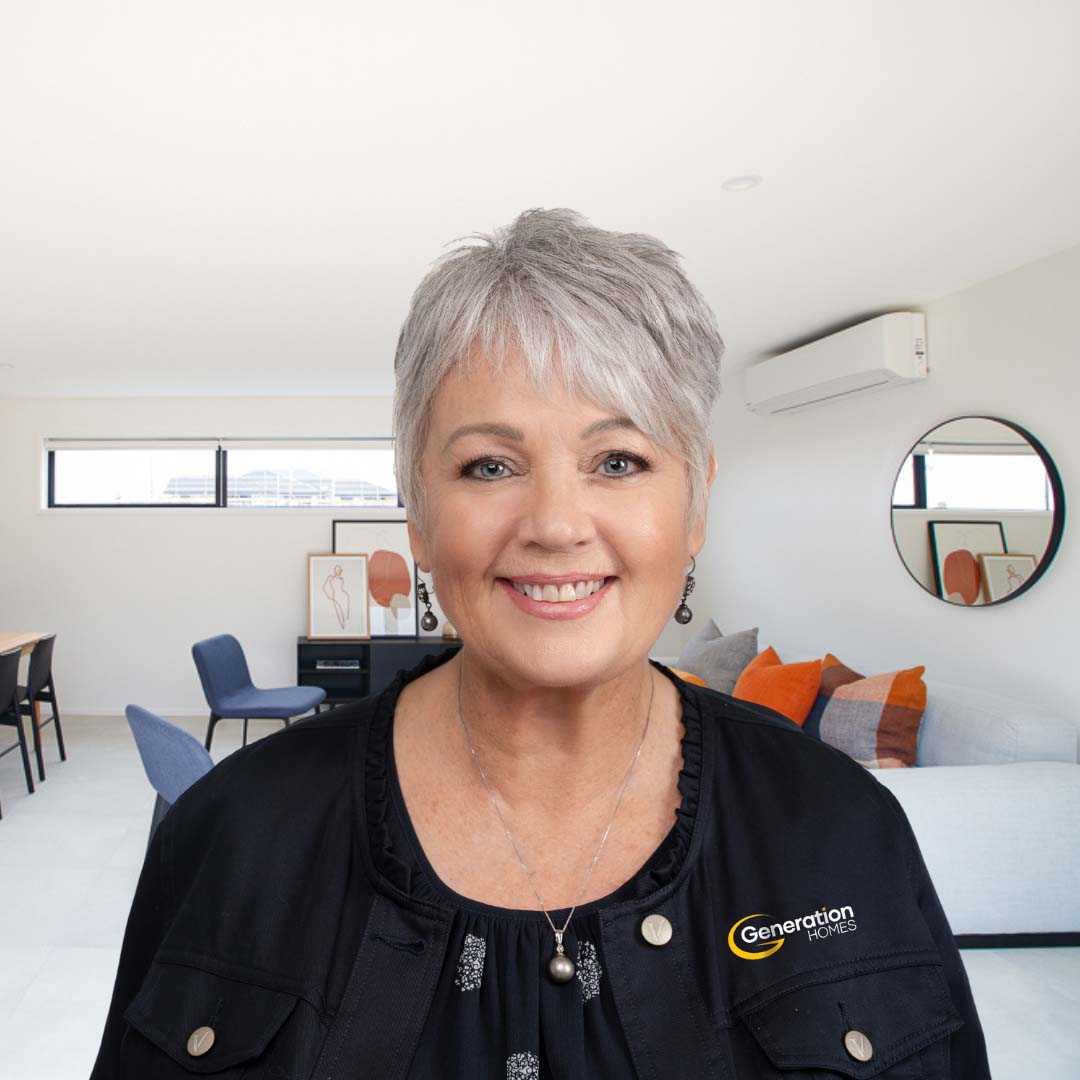
Suanne Jackson has an impressive 20 years' experience in interior design and new home sales. Her passion lies in assisting clients in realizing their dream of home ownership, whether as a first home buyer or beyond.Sue joined Generation Homes in 2014 as it was a trusted name in the construction industry. Generation Homes is renowned for offering genuine fixed price building contracts with a guaranteed build time frame, embodying trust, and reliability along with excellent build quality. These are values that align seamlessly with Suanne’s commitment to trust and professionalism. She has provided guidance and care to hundreds of clients and her unwavering dedication and wealth of experience makes her a trusted advisor and invaluable resource.
Peter has been in the Building Industry for 30 years, progressing from carpentry apprentice through to site management before moving into the Auckland “Group housing” industry. The experience and knowledge gained to date provides a sound platform for the growth of Generation Homes within the Northern region of Auckland.
Nadine has been working with Generation Homes for a number of years and is familiar with the property market in the northern suburbs of Auckland. If you are looking to build and would like to know more about our process and packages available, speak to Nadine today.
Norman is an expert in the housing market in the northern suburbs of Auckland. He will be able to talk you through the different options we have in the market at the moment. If you are looking to invest in a rental property, Norman has a high level of knowledge around the current rental market and returns.
Mackenzie Suckling has building in her DNA, having grown up with her father, Peter Suckling, the Managing Director of Generation Homes Auckland North. With a deep understanding of the industry from an early age, Mackenzie has seamlessly progressed into her sales career, thoroughly learning the background of the business. Her proficiency with computer systems ensures seamless administration and effective marketing strategies. You are in great hands with Mackenzie, as she understands building from the ground up. Let Mackenzie show you how Generation Homes makes building easy.
Suanne Jackson has an impressive 20 years' experience in interior design and new home sales. Her passion lies in assisting clients in realizing their dream of home ownership, whether as a first home buyer or beyond.Sue joined Generation Homes in 2014 as it was a trusted name in the construction industry. Generation Homes is renowned for offering genuine fixed price building contracts with a guaranteed build time frame, embodying trust, and reliability along with excellent build quality. These are values that align seamlessly with Suanne’s commitment to trust and professionalism. She has provided guidance and care to hundreds of clients and her unwavering dedication and wealth of experience makes her a trusted advisor and invaluable resource.
BUILD WITH US
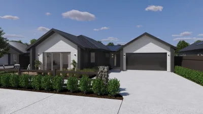
Generation Homes have a range of quality and stylish house only packages available throughout the region.
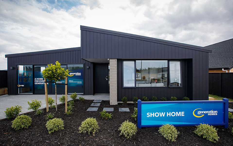
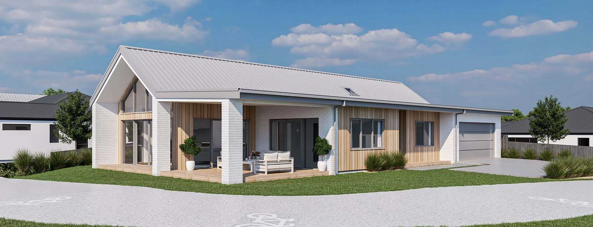
Find inspiration and ideas for your new home by visiting one of our Show Homes and see the range of styles and designs available.

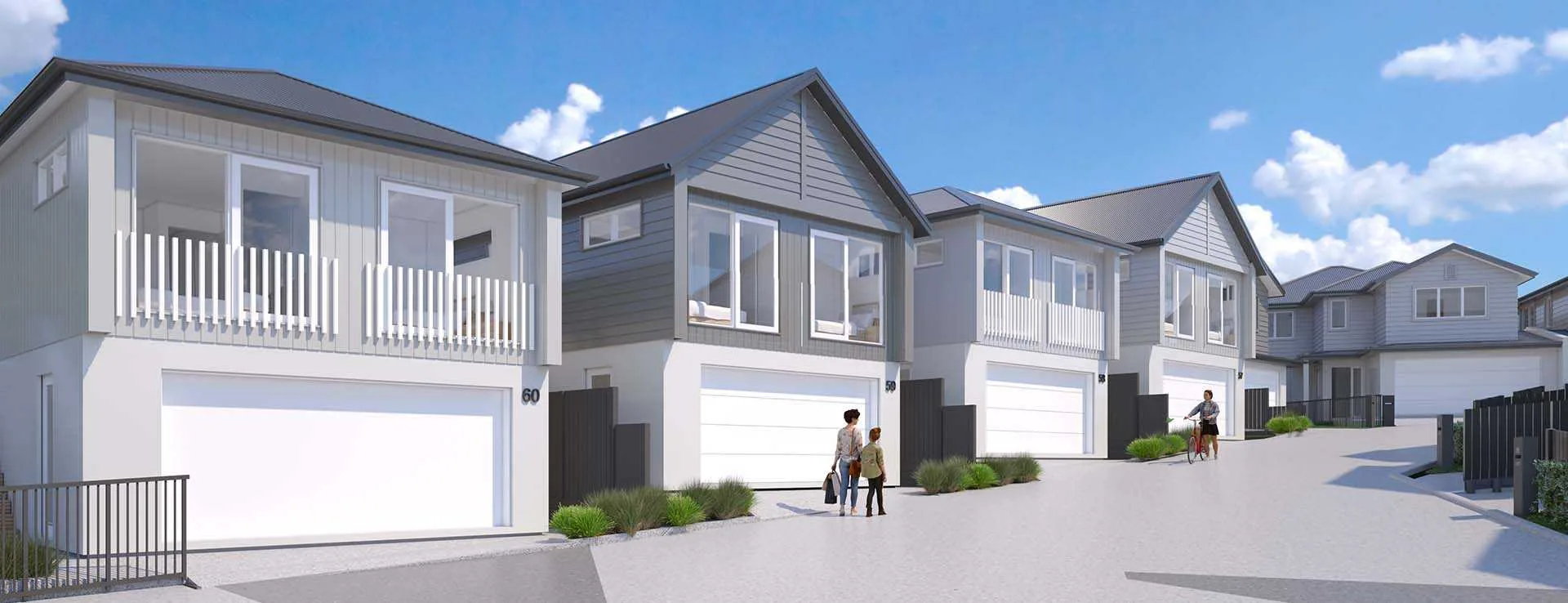
We build in subdivisions in a wide range of locations throughout the region. Find a location that you and your family will love.
A significant aspect of Generation Homes' success story lies in the numerous satisfied clients we've had. Discover their testimonials here.

Our Sales Team will guide you through your new home journey, from design, all the way through your build, to handover and beyond.