Take notes from this masterclass on how to nail pale. We could tell you how popular Resene’s white and neutral paints are, dominating the Resene top 20 list across the board year after year, but you’re not here to keep up with the Joneses. You just want to know which are right for you and how you could use them, so let’s get down to it.
Middle ground
The Resene Whites & Neutrals collection is your one-stop shop, a trusted compilation of palette cards that include colours in various strengths to help you play to yours when creating cohesive schemes that also provide visual interest.
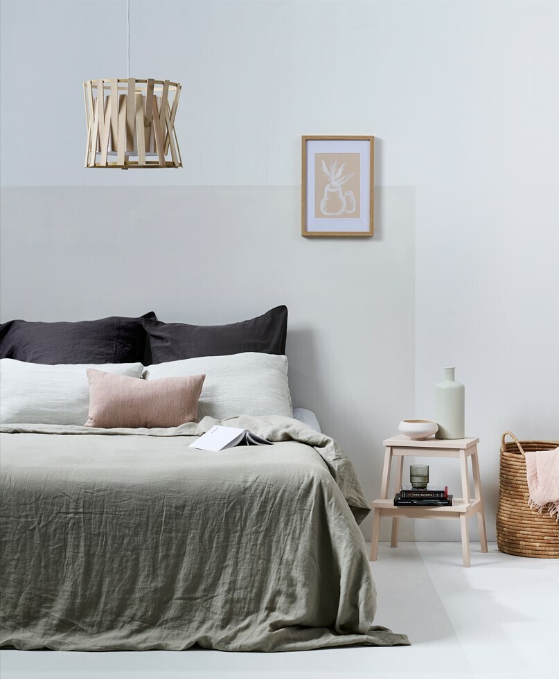
Soft, chalky, calcite-grey white Resene Black White is one of its top contenders, the hint of black in its makeup resulting in one of the ultimate white paints — one that’s ideal for you if you want something that gracefully walks the line between warm and cool.
Dreaming of using white for its calming qualities? In this bedroom, Resene Black White is used in two of its six available strengths to bring a soothing sense of restfulness to a bedroom, with a paler shade coating the walls and floor, and a heavier version creating a colour-blocked headboard effect that frames the bed in minimalist style.
Sleep easy by tying it all together with tonal accessories - we’ve used inexpensive Resene testpots to paint artwork and objects in complementary colours and opted for natural materials and cosy textiles to offset the bleached backdrop.
Colour chameleon
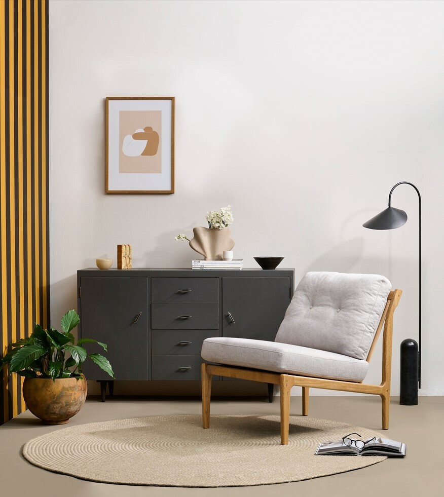
In this scheme, a neutral paint is the basis of a look that’s pale and interesting — perfect for those who wonder if true white isn’t quite adventurous enough.
Anchoring a living space, soft, muted beige Resene Quarter Tea on the wall forms a blank canvas for artwork and other items yet is anything but boring when teamed with contrasting colours.
Like whites, neutrals also have the benefit of being timeless, allowing you to easily alter your décor items as your tastes change, while your backdrop stays relevant.
See how Resene Quarter Tea appears lighter on the wall when set against the striped accent and charcoal sideboard?
How a paint appears in your unique space is determined by the other hues in it, the light, the outlook, and the finish you choose, from gloss to matte.
Take all of these factors into account when making your selection, using Resene testpots or Resene A4 drawdown paint swatches to trial possible paints at your place, examining them in natural and artificial light throughout the day.
A word to the wise about ceilings too: less light is reflected from these surfaces, so choose a half or quarter strength of your wall colour for overall balance in a flat finish like Resene SpaceCote Flat.
More ways than one
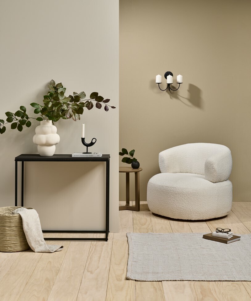
Roll out the welcome mat for this chic circulation space, which shows how several strengths of a neutral hue - Resene Bison Hide, a warm green beige with white tones — can be used in an entryway to provide depth and interest, greeting you at the front door as Resene Half Bison Hide, then transitioning to Resene Triple Bison Hide.
Another way with white is provided on the floorboards, which are stained with Resene Colorwood Whitewash, an Environmental Choice-approved product that allows the grain of the timber to show through, inviting subtle visual texture into this relatively utilitarian space.
Paler and darker accessories balance the palette and are enhanced by pieces that are both pleasingly tactile and practical, like the rug for wet feet and the bouclé armchair on which you can sit to take off your shoes.
Round it out with greenery to usher a hint of the outside in.
The fine print
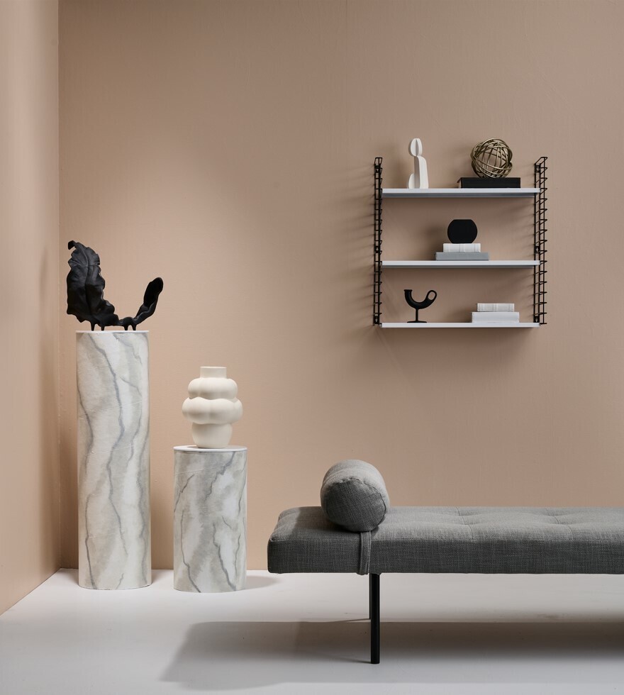
Whites and neutrals aren’t only ideal for a home’s main zones – you could also play curator and employ them in an underused corner to create a reading nook/gallery space that lets your favourite objects do the talking without seeming sterile.
This space is elevated by Resene Quarter Rakaia on the floor, a cool light grey that taps into the tones of the painted plinths (made from fibreboard cylinders that are more practical to move than marble) in Resene Alabaster, a white with a slight blackened edge.
Sticking with matching undertones is your key to success when combining whites and neutrals, and both of these paints fall into the neutral ‘N’ category.
Discover whether a paint you’re considering has cool undertones of neutral (N) or green (G) (which are ideal for making small, light-filled spaces seem more spacious and contemporary), or warm undertones of yellow (Y) or brown (BR) (which are great for making large or cold spaces with low light feel cosier) by checking the letter at the start of the code beside the paint name on the Resene Whites & Neutrals colour chart.
Choose your favourite from the Resene Top 20 online and get more colour inspiration, www.resene.co.nz/top20
Then visit your Resene ColorShop for all the advice and products you need to bring out the best in your home.
*RESENE IMAGE CREDITS
Middle ground - Wall and floor in Resene Quarter Black White, headboard in Resene Double Black White, stool in Resene Alpaca, pendant light in Resene Colorwood Whitewash, artwork in Resene Quarter Black White and Resene Alpaca, bowl in Resene Lemon Grass and vase in Resene Kangaroo. Bedding, cushions, throw and basket from Città, glass from Freedom. Project by Laura Lynn Johnston, image by Bryce Carleton.
Colour chameleon - Left wall in Resene Rusty Nail and Resene Blackout; right wall in Resene Quarter Tea, floor in Resene Talisman, sideboard in Resene Karen Walker Chalk Paint in Resene Fuscous Grey, with Resene Karen Walker Soft Wax in Natural and feet in Resene Blackout, large pot in Resene FX Rust Effec, small pot in Resene Quarter Tea and small dish in Resene Blackout. Artwork by Yamila Palatnik from Endemic World, side table from Bohzali, round glass dish from Ornament, standing object from Burrell Salvage, vase from Dandie Store, rug from The Ivy House, chair from The Cane Collective, lamp from Slow. Project by Kate Alexander, image by Bryce Carleton.
More ways than one - Left wall in Resene Half Bison Hide, right wall in Resene Triple Bison Hide, floor in Resene Colorwood Whitewash, hall table in Resene Bokara Grey, side table in Resene Tobacco Brown and bud vase in Resene Eighth Thorndon Cream. Throw from BoConcept, remaining vases from Slow, candleholder from Good Form. Project by Melle Van Sambeek, image by Bryce Carleton.
The fine print - Walls in Resene Cashmere; floor in Resene Quarter Rakaia; plinths in Resene Alabaster, with veining in Resene FX Paint Effects Medium coloured with Resene Half Stack; circle and wobbly vase in Resene Innuendo and candleholders in Resene Lonestar. Crescent sculpture from BoConcept, large vase from Slow, shelving and white Gidon Bing sculpture from Good Form, chaise longue from David Shaw. Project by Melle Van Sambeek, image by Bryce Carleton.
Article published with the permisson of Resene.