Colour is a powerful component of home design, so each year we anticipate the Dulux colour forecast to discover fresh trends and gain inspiration for colourways to enrich the home. This year’s Dulux colour trends reflect an inner desire for positivity and spaces that nurture within our homes. The 2024 forecast has identified three colour palettes, Solstice, Journey and Muse, which feature mid-toned hues with rich golds, olive greens and reddy browns.
Colour Specialist Davina Harper, explains, “there is a really important element to this year’s Forecast in the way it invites colour and texture into the home. We can see yellow and rich gold becoming more prominent in this year’s palettes. Furthermore, the zesty green and clay brown shades that we saw coming through in the 2023 Colour Forecast are transitioning to a warmer space, featuring yellow and subtle red undertones. We are seeing some lightness in colour, however the majority of shades are mid-tone with darker shades predominantly used for small accents. The warmth we’re seeing across each of the 2024 Colour Forecast palettes is the answer for consumers who are looking to add positivity by adding colour in their homes.”
Alongside warmer palettes, Colour Forecaster and Stylist Bree Leech advises tactility will be another important focus for the year ahead. “The colours are richer and there are less pastel and bright hues, compared to what we saw last year with a shift towards more sophisticated nostalgic references.”
Solstice
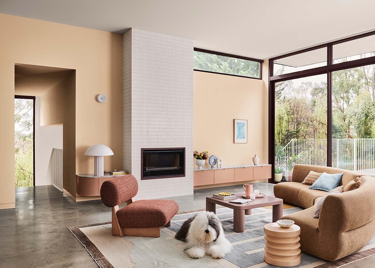
Dulux Solstice is a warm and reflective palette of rich browns, clay and warm neutrals with a sun loving yellow as an accent, designed to evoke a comforting, familiar and inviting feeling.
Sun-soaked neutrals are influenced by a soft orange glow and paired with softer shades of pastel blues and citrus yellow. This trend embodies a harmonious blend of cosy and calm styling elements, with captivating material highlights like natural stone, ceramic and highly textured fabrics.
According to Leech, Solstice starts with inspiration from the pared back Scandinavian design style but adds a Mediterranean and desert influence. “From the Australian outback to the African savannah, the palette brings together warm colours with cooler accents and tactile details, such as braiding and primitive sculptural forms.”
Solstice colour palette; the colours are Dulux Ponsonby and Paekākārik; Dulux Colour Forecaster & Stylist: Bree Leech; and Photographer: Lisa Cohen.
Journey
Dulux Journey takes inspiration from our travels and cultural differences, highlighting rich mid-tone hues with yellow green at the heart with rich decadent reds for contrast. “At its core, Journey celebrates the art of storytelling, where mythical iconography and cherished folk aesthetics find their rightful place, adding layers of depth and colour to your space,” Harper explains.
Olive greens and pale yellow are prominent shades within the Journey colour palette, with dusty blues and rich burgundy acting as accents within a mix of faded and soft textured furnishings and handmade pieces including painted wicker.
The Journey palette has a much more eclectic and maximalist feel and brings together global influences to reflect on the history of our ancestry through objects and items handed down through time.
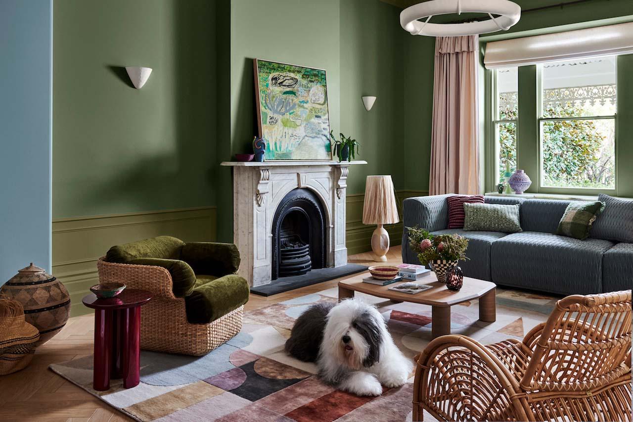
Journey colour palette: the colours are Dulux Murrays Bay, Tarras and Te Horo; Dulux Colour Forecaster & Stylist: Bree Leech; and Photographer: Lisa Cohen.
Muse
Heavily influenced by the nostalgia of the postmodern era, with a particular emphasis on the 70s, the Dulux Muse palette is a celebration of modernising the free spirited styles of the past.
“Whilst sustainability is an underlying theme for each of the 2024 Colour Forecast palettes, it’s particularly prominent within the Muse palette as we reimagine past trends with vintage pieces, to create an interior that feels unmistakably contemporary,” Harper explains.
The Muse palette is a colourful array of hues predominantly in the mid-tone with warm brown and rich tans, accented with deep blues and soothing greens, to create a distinctly modern interior that has been fused with nostalgic design references reminiscent of the 60s to the 80s, in addition to the textures and glamour from the 70s.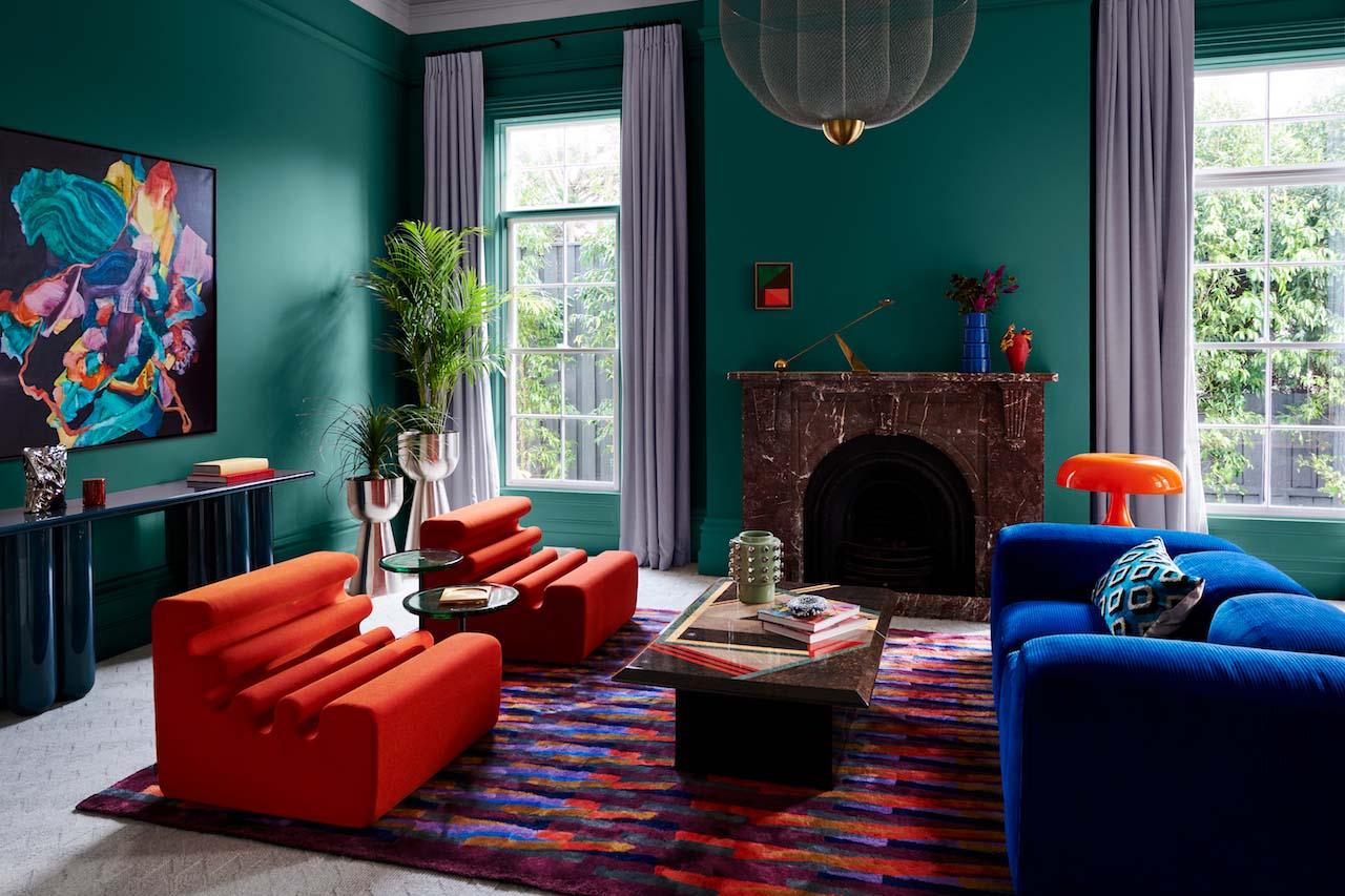
Muse colour palette; the colours are Dulux Guitar and Fantan; Dulux Colour Forecaster & Stylist: Bree Leech; Photographer: Lisa Cohen.
Dulux Colour Forecast 2024 integration tips by Davina Harper
Article prepared with the assistance of Dulux: www.dulux.co.nz